

Magasin is about 5.5 years old, and just yesterday, we sent out our 500th (ish) newsletter. All the while, Magasin has looked as it had since day 0. But actually, a lot has changed in that time. The newsletter still (mostly) gets dispatched from my dining table or from my phone in the back of an Uber. It still reports shopping news (best, fastest, and most thoroughly). But, it’s not the Laura Reilly show any more. Magasin is also its industry-steering columnists, its editorial team, its data scientists and programmers, its partnerships apparatus, the High Touch universe of contributors, aesthetic professionals, fact checkers…I’ll forgive you if you missed this, but along the way, Magasin became a fully fledged publication.
When I decided it was time for Magasin’s look and feel to catch up to its new reality, I reached out to my friend Andrew J.S. whose agency AP was better equipped to handle telegraphing this transformation than any. We share a kind of deadpan, less-is-more ethos that trusts the audience to pick up what’s being put down without overt exposition. And boy did he deliver.
The rebrand process was so in-the-details and Magasin-y itself that I wanted to share publicly some of the brilliant details included in Andrew’s presentation decks to me throughout the process, direct from Andrew himself. You can read our interview and explore the etymology of the new (hard-launched!) Magasin below.
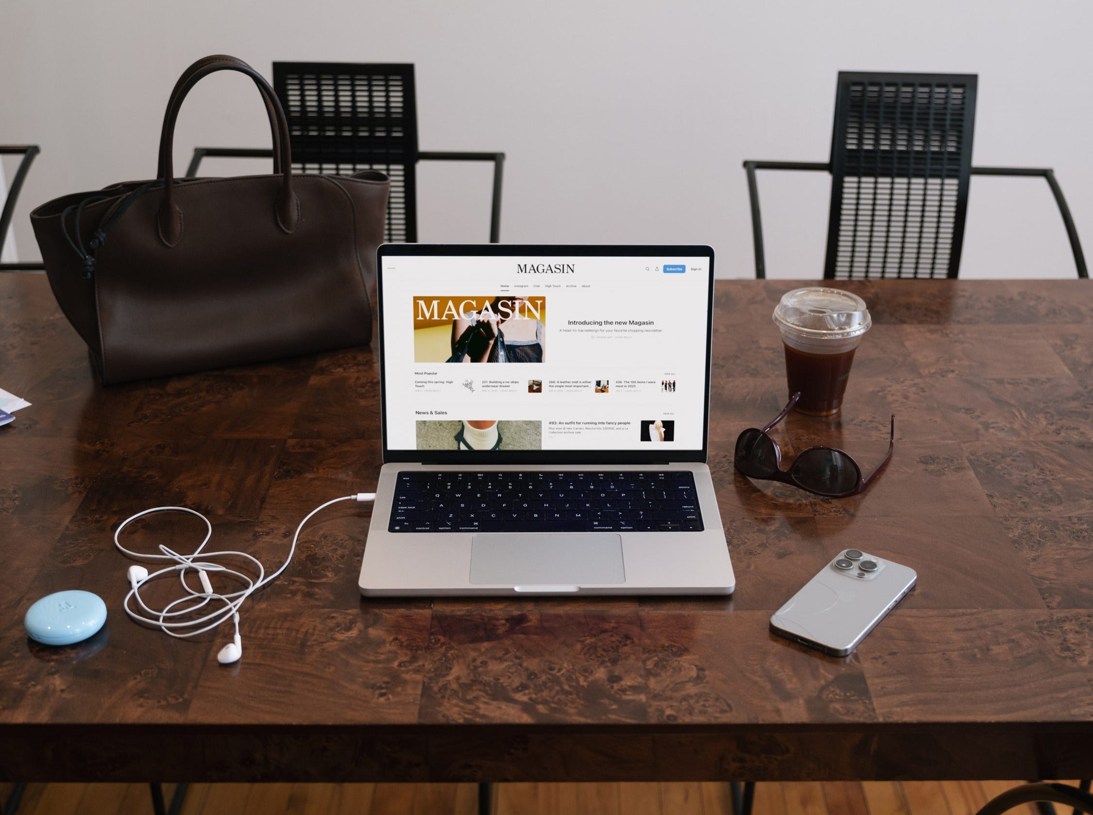
What was your vision for Magasin? What bits of the Magasin identity were most essential to convey through the design? What did you want to protect from the existing branding?
On a gut level, I knew it needed to go shoulder to shoulder with the kinds of things that it covers—fashion, high design et al. But it also needed to live outside the world of DTC or luxury spaces, resisting the impulse to participate directly as a brand. I love balancing an identity on that kind of tension.
The most important thing I wanted to carry forward was the Magasin voice. You had already come up with some fun visual hooks, like the iPhone text highlights and iMessage screencaps, and had a clear vision with Brand Rank, News sends et al. My approach was to take what you were already doing and make it look more intentional.
I like that we never once moodboarded. You told me early on that’s not part of your process, and I really appreciate that (everything is a moodboard now, never a finished product). How did reference material factor into this process?
That’s right—how is it that everyone in the creative industry agreed that collecting other people’s work is the best way to start a new project? I spent years doing this at agencies before I started my own, but it never really felt good or made sense to me. More importantly, I don’t think it made any genuinely good work. We really need to dismantle the moodboard industrial complex.
I call our pre-design phase Source Material. Instead of looking at refs or screencaps or saved folders, I share a focused survey of root-level design elements like typography, language and color, maybe some prelim gestures in layout and scale. It’s a bit like sharing a material palette for an architecture project, combined with some hi-fidelity sketching.
A lot of it is just instinct for me, but the process is still very much research-driven. It also requires a lot of trust and in-depthconversation, but ultimately we end up agreeing to make what we really want to make.
As for actual materials, esp in the case of Magasin, I have a very specific and reliable stable of beautiful typefaces that I’ve collected over the years, but I still wind up spending the majority of my research time digging into type, going somewhere first, finding early antecedents or imperfect renditions and seeing where that takes us.
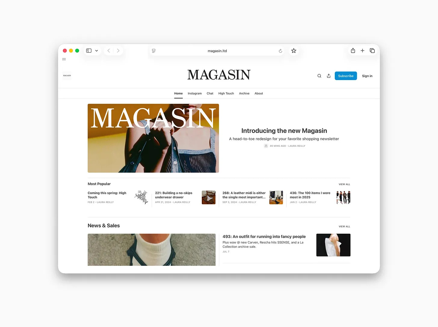
The first direction you presented to me felt immediately right, but then the tailoring really distinguished it. Surgical precision. Can you share some of that here? Mock-ups, etc.
Definitely—for the type heads in the audience I’ll start by saying that the logotype is based on a funky old cut of Century. Century dates all the way back to the 1890s, making its debut in print as Century Roman by ATF. It was later adapted for use in schoolbooks because it’s clear, legible and beautiful, but it also has a lot of character. I feel like it’s the kind of face that could make a kid fall in love with type but not really know why.
Century Schoolbook, a widely available digital rendition of this typeface, has a nice feel, but doesn’t get all the way there for Magasin. For the body copy, I sourced an unlisted digitization of Century from the 1980s that’s notable for its lack of contrast compared to current retail versions of the face—that is to say, the thick and thin parts of the characters are closer together in weight, making for a slightly heavier appearance on the screen and an inkier feel that (to me) feels more like the printed page.
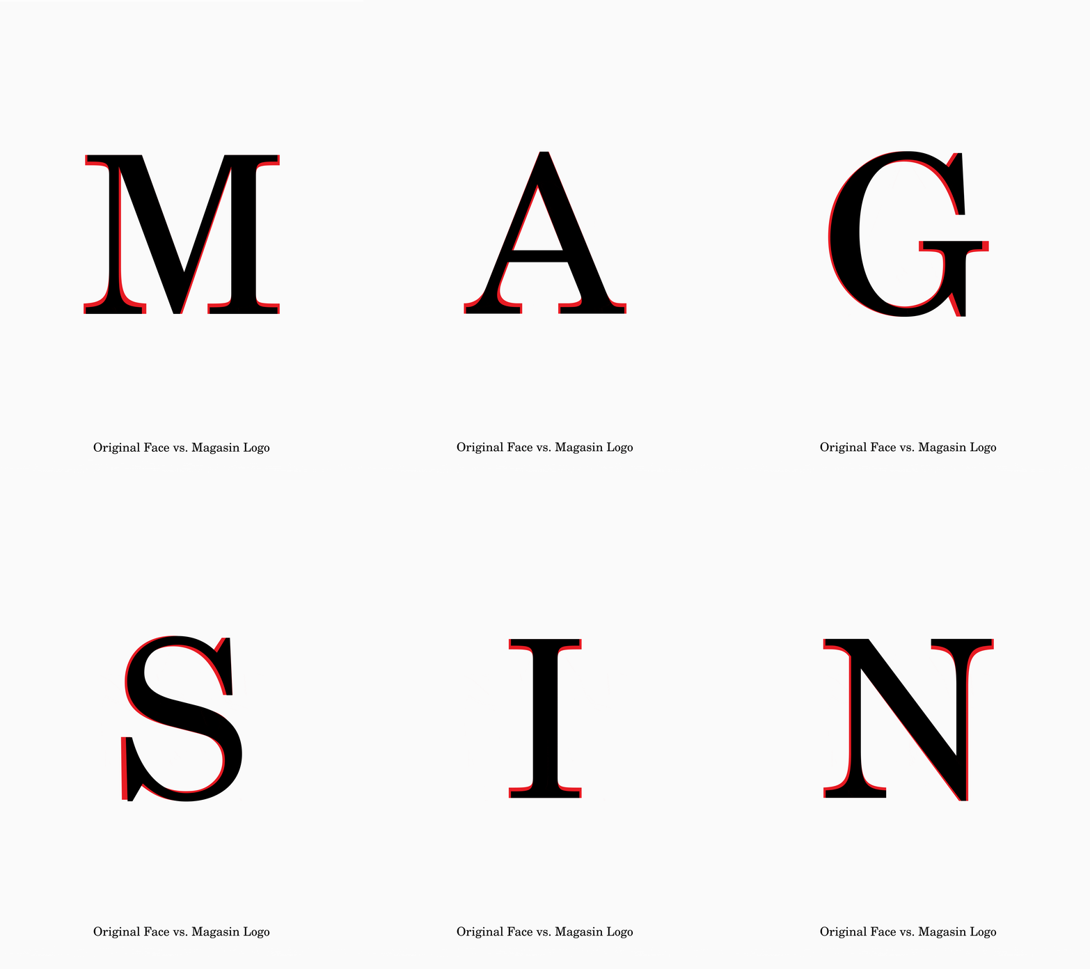
Text weight set the tone and really connected with the Magasin voice, but as-is it didn’t solve for the masthead. Ultimately we want the logotype or wordmark to act like a display object, so it can sit at the top of a layout like an actual magazine cover whether printed or digital. However, so many of the things that make the type nice at body copy size aren’t so nice to look at writ large.
I worked with our type designer, Chase Booker (who with this last name also spends time designing books for the likes of Fondazione Prada, Serpentine Galleries, and the New York Review of Architecture), to sculpt the Magasin logotype by hand.
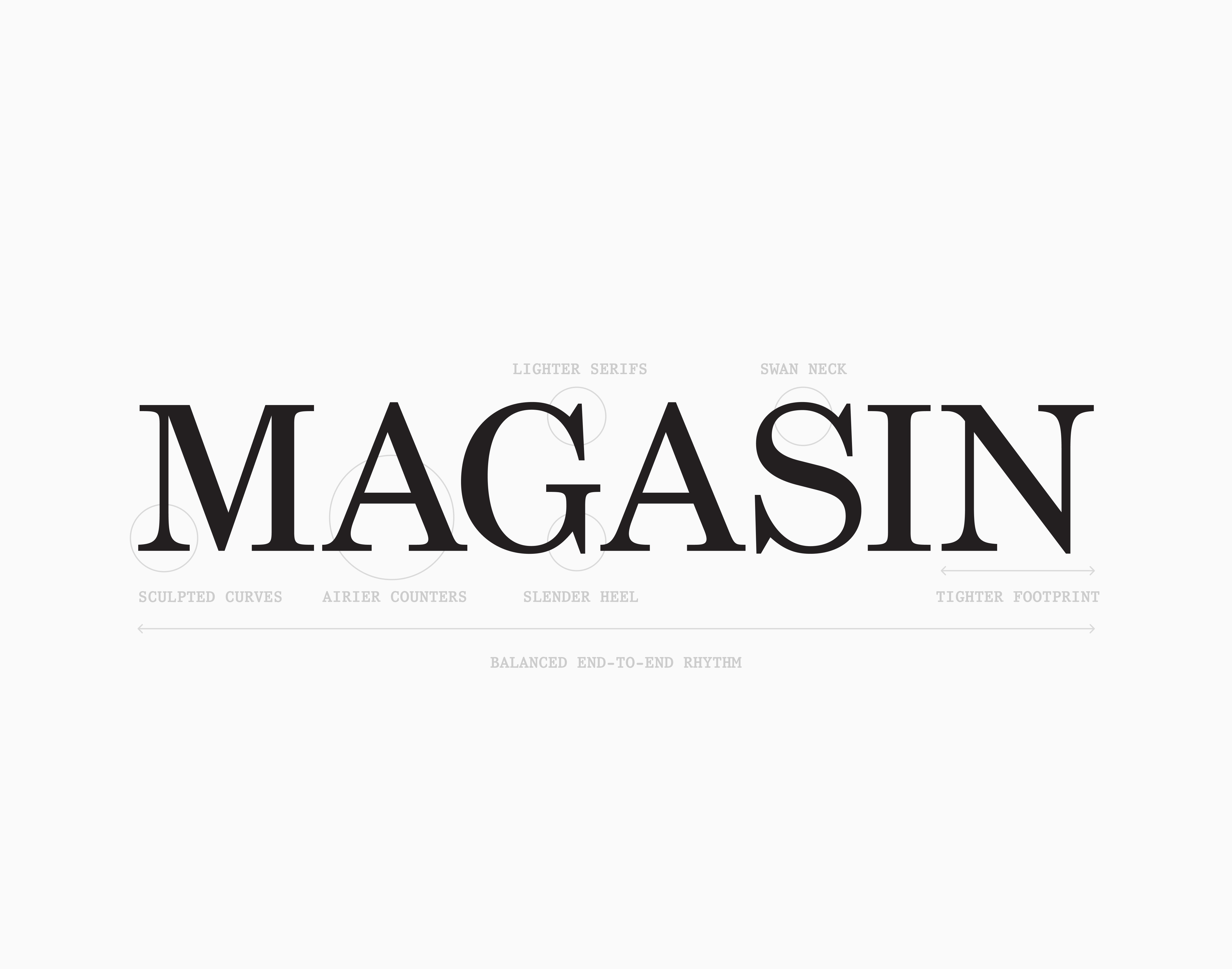
The process is a lot like tailoring, where you find a perfect vintage dress but it doesn’t quite fit or drape the right way. We looked at qualities of transitional serifs [e.g. the GOAT Times New Roman, or my favorite Times Now by Jan Henrik Arnold which I’ve used since its release, seen here on Éditions], and applied them to our special cut of Century. The changes might seem small, but the difference is dramatic—note the lightened slab serifs that free up plunging swan neck of the S, the sculptural feet of the M, A and I, a nicer overall rhythm across the characters.
What makes designing a newsletter different from designing a brand or a traditional publisher? What’s the visual default for a newsletter right now, and how did you deliberately steer away from it?
The touchpoints are different, and there’s not a lot of control on a platform like Substack beyond header placement, images, and choosing from a few default fonts. I also don’t think that stuff needs to be overly-customized, it’s totally functional and does what it needs to do. That’s why we put a lot of emphasis on translating Magasin content into social media, creating the kinds of tools we might hand over to an independent brand or upstart.
I see a lot of things that are over-designed or needlessly aestheticized (including much of my earlier work) and in general I find a lot of design to be suffocating. My approach is always to let things breathe, but without losing specificity—that’s exactly what we did with Magasin.
We rolled High Touch out first, even though we decided to originate directions for both titles in tandem. Tell us about the High Touch look.
I came up with a few directions for High Touch, and I think you rightly connected with what was literally the lightest touch (haha). It’s a similar positioning, where it deals in a particular space but doesn’t participate directly, e.g. it doesn’t have to live on a box or bottle. I love that it sort of feels like a fictional identity made for an early 2000s scifi movie, but it’s also very soft and universal. Keeping things restrained allows a lot of room for different kinds of subject matter to be explored, and leaves things open for growth over time.
This is a shopping newsletter. What are the last, best things you bought?
OK this is basically over like a five year window, but when it comes to clothes, I do most of my shopping on eBay or at vintage spots. I turned 40 yesterday, and after so long working in design and fashion, I’ve found myself returning to the things I wore growing up in the middle of nowhere in WA and OR. For me this means secondhand military pants, comfy novelty tees, thermals and hoodies, running gear, sport shorts, baseball hats from all the places I’m lucky enough to visit. It feels good, easy.
Living life with a dog who is basically an olympic athlete has also fundamentally changed my POV on clothes—if I can’t keep up with him there’s no point in wearing it. The only thing I’ll splash out on new is footwear, but these days pretty much only wearing Xero sandals, hybrid or approach shoes, et al.
I guess my favorite things remind me of my life and the way I live it, if that makes sense.
And—for the longevity freaks—what’s the most High Touch thing you do?
As the son of a two-time cancer survivor (hi mom!), I discovered a couple years that have the BRCA2 mutation (the bad boy sibling of BRCA1 a.k.a. The Angelina Jolie gene) and have turned into a hypervigilant cancer screening freak. I treat myself as if I were a fifty year old (at my doctor’s orders), get routine derm checkups (I’m overdue right now), gastro appts, mammograms (yes anyone can get them) etc. I’m also very conscious of everything that goes into my body, all whole foods, no plastic stuff in the kitchen, drink tons of water daily, lots of walking/running and kettlebell for fun.
I also stopped drinking alcohol seven years ago (kind of on accident, medium-length story if anyone ever wants to hear it) and I think that’s the single most important thing I’ve ever done for my mind and body. There’s no way to know if this will actually help me live any longer, but I’ve never felt better so that’s enough of a reason for me :)
Magasin may earn some money if you make a purchase through one of the links above.
Follow us on Instagram at @magasin.ltd.
Beautiful.
LOVE